Making 833 brain regions explorable — a data dashboard for drug discovery research
Brain data, made navigable
Brain Data Explorer is an interactive dashboard I built in 2 hours at the Explainable Brains Hackathon in Copenhagen, hosted by Vibraint ApS, a biotech company working on drug discovery tools for brain diseases. The brief was to make raw brain imaging data actually usable: 833 brain regions measured across two experimental groups, statistical outputs that only make sense if you know what you're looking at.
The result is a self-contained web tool that lets neuroscientists and drug developers explore the data visually, filter it, and ask questions in plain language. No code required, no spreadsheets.
Designer on a cross-disciplinary team, with AI co-pilot
I was the designer and builder, responsible for translating the data into a visual interface, making implementation decisions, and shipping something usable in 2 hours. The team also included a neuroscientist, a computer modeling specialist, a data analyst, and a computer scientist. That mix mattered: having a neuroscientist in the room meant the network groupings weren't pure guesswork, and the data interpretation had domain grounding from the start.
I used Claude Code as an AI co-pilot for implementation, which let me move faster on the frontend than I would have alone. The design decisions were mine; Claude handled boilerplate and helped debug the NiivueJS integration for 3D rendering.
This wasn't a design-then-handoff workflow. It was design-in-browser, deciding as I went. The constraint forced prioritisation: what does a scientist need to see first, and what can wait?
833 regions. Two file formats. No way in without code.
Vibraint's pipeline produces two things: spreadsheets of statistical comparisons and 3D NIfTI brain maps (volumetric spatial data). The dataset is from a study on mice treated with Semaglutide (the active compound in Ozempic/Wegovy) versus control mice, using c-Fos (a protein that acts as a proxy for neuronal activation) as the measurement marker. 833 brain regions were measured. 37 show differences at p<0.05 uncorrected; none survive multiple-testing correction.
The problem isn't the data quality. It's access. To get anything meaningful out of it, you need neuroscience domain knowledge, statistical literacy, and either Python skills or expensive software. Drug developers asking ‘which brain circuits does Semaglutide actually affect?’ can't answer that from a spreadsheet.
“The data is simultaneously rich and opaque. You need domain knowledge AND statistical literacy AND the right tools to get anything out of it.”
Key design decisions
Volcano plot as the entry point
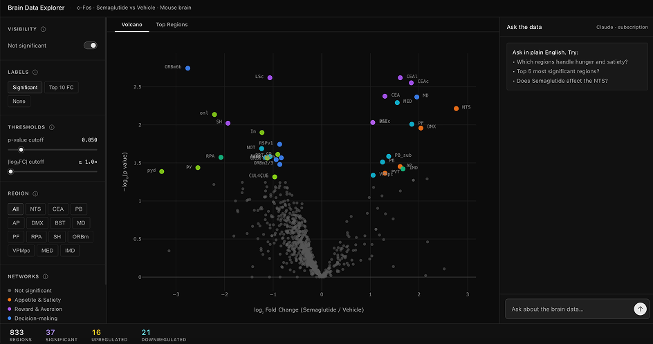
- A volcano plot maps log₂ fold change on the x-axis against −log₁₀(p-value) on the y-axis, so all 833 brain regions appear as dots simultaneously. You see statistical significance and effect size at the same time. Starting with a filtered list would hide the shape of the data: that most regions don't change much, that significant regions cluster toward brainstem and reward circuits, that the distribution is asymmetric. Scientists need the whole picture before they narrow down.
Network color coding instead of anatomical grouping
- I grouped regions into 6 functional networks: Appetite & Satiety, Reward & Aversion, Decision-making, Pain & Interoception, Arousal & Mood, Motor & Coordination. Anatomical groupings (cortex, subcortex) would have been structurally accurate but biologically less readable for this specific question. Semaglutide is a GLP-1 agonist with known effects on satiety and reward circuitry, and seeing those networks light up together as color clusters is immediately more interpretable than a scatter of anatomical categories.
Shared filter state across both chart views
- The sidebar controls (p-value threshold, fold-change cutoff, region chips, non-significant toggle) apply to both the Volcano and Top Regions views simultaneously. Switching between them doesn't reset your exploration. This matters for a scientific workflow where you're narrowing hypotheses iteratively, not starting fresh every time you change chart type.
AI chat as a second layer, not the primary surface
- The "Ask the data" panel lets Claude answer plain-language questions: what is the NTS? What does CEA upregulation mean here? I kept it secondary to the charts deliberately. A chatbot-first design would hide the data behind a conversation interface. The whole point is that scientists should see the data, then ask questions about what they're seeing.
Four views, one filter state
The dashboard opens on the Volcano Plot with all 833 regions visible. Significant points are labeled and color-coded by functional network; non-significant regions are gray by default. A persistent stats bar at the bottom always reflects the current filter state (total regions, significant, upregulated, downregulated), updating live as you move any threshold.
Volcano Plot
- All 833 regions as a scatter. X: log₂ fold change. Y: −log₁₀(p-value). Color by functional network. Hover for full stats. The whole dataset visible at once — the shape of the data, before filtering.
Top Regions
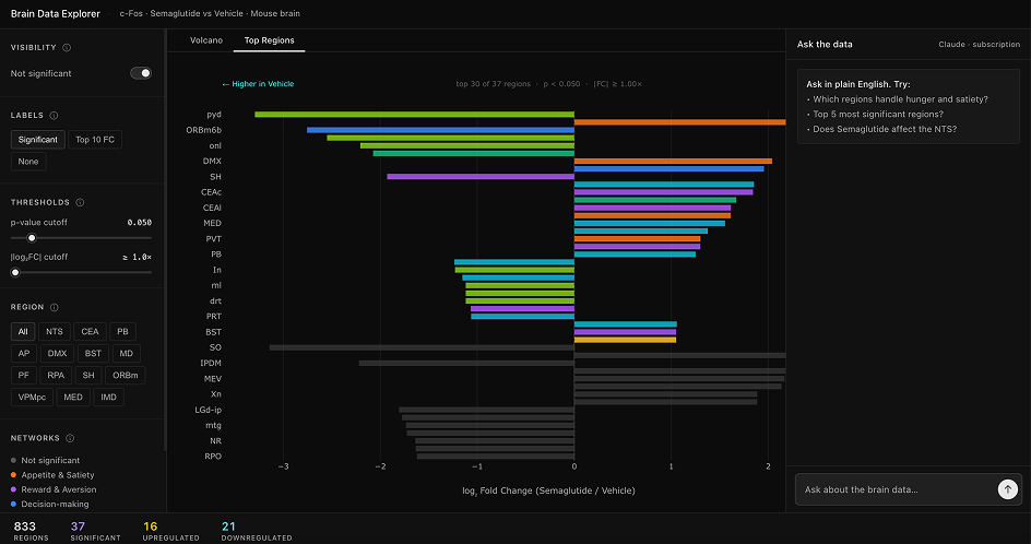
- Horizontal bar chart of top 30 significant regions sorted by effect size. Direction labels — "← Higher in Vehicle" / "Higher in Semaglutide →" — so you can read directionality without parsing sign conventions.
3D Brain Viewer
- Per-network modal rendering the NIfTI atlas with WebGL. Axial, coronal, sagittal, and full 3D views with the network overlay. Where these regions sit in the brain, not just how they compare statistically.
AI Chat Panel
- Right-rail panel with Claude. Pre-seeded example prompts. Claude has the study context and top 100 regions in its system prompt — answers are grounded in the actual data, not generic neuroscience.
With more time, I'd talk to more scientists
Having a neuroscientist on the team meant the network groupings weren't pure invention; there was domain input. But one scientist in a 2-hour sprint doesn't give you depth or disagreement. Different neuroscientists have different views on functional groupings, and the literature is contested in places. With more time I'd run structured conversations with scientists who work specifically on satiety circuits, reward systems, and brainstem function to pressure-test the taxonomy and surface where the groupings are genuinely uncertain rather than just convenient.
A functional data explorer, built in two hours
In 2 hours I shipped a functional data exploration tool: volcano plot, bar chart, 3D brain viewer, live filtering, and an AI interpretation layer, all working on the real Vibraint dataset. The visualization side is deployed and usable at explainable-brains-hackathon.vercel.app.
What the sprint clarified: designing for scientists is mostly a data literacy problem, not a UI problem. The hard work isn't making things look clean. It's deciding what the data means and how to encode that meaning visually. The network colour coding, the volcano plot choice, the direction labels on the bar chart: all decisions about translating domain knowledge into visual form. Getting them right requires close collaboration with domain experts. Something we had in compressed form during the sprint, and something worth building on properly.