Redesigning a SaaS platform for photo booth operators — web and mobile
Building software for the photo booth industry
Photobooth Supply Co. makes hardware and software for photo booth operators — people who run photo booths at weddings, corporate events, and parties. Fiesta is their SaaS platform, letting operators manage their events, configure their booths, control what guests see and print, and handle their galleries.
The platform exists as both a web app (where operators do most of their setup and management) and a mobile iOS app (used on event days). I joined as the product designer responsible for both.
A wide range of users — not just one type of operator
The people using Fiesta are photo booth operators, but that's where the similarity ends. Some are highly technical — they want granular control, custom configurations, and they'll read documentation. Others are not tech-savvy at all and need the software to be self-explanatory. The age range runs from early twenties to people who've retired from another career and bought a photo booth as a new venture.
Some users run their booth as a weekend side hustle alongside a full-time office job. Others have it as their sole source of income — a full-time business with multiple booths and staff. They come from very different backgrounds: photographers, wedding and event planners, DJs, hospitality workers, and people with no event industry background at all who simply decided to start a business.
Designing for this range, same product, same screens, meant the interface had to work for the expert who wants speed and power, and the first-timer who needs clarity and confidence on event day when things go wrong.
Product designer across web and mobile
I've been the product designer on Fiesta for 5 years, working at Photobooth Supply Co. as part of a two-person design team. My work spanned the full product — from the operator-facing admin platform to the guest experience. I worked closely with engineering, product managers and stakeholders on everything from new feature design to information architecture to the design systems that keep both platforms consistent.
The work covers the full design process: research and discovery, informational architechture and flows, component design, prototyping, handoff, and ongoing iteration after launch.
One product, an enormous range of people using it
The core challenge wasn't a broken product, it was a product that had grown organically to serve an extremely wide range of operators with fundamentally different mental models, technical comfort levels, and workflows. Someone who runs photo booths full-time and has used the software for years approaches it completely differently from someone who bought a booth as a weekend side business and opens the app once a month.
“I have support articles printed out to help me set up an event.”
The platform had to work for both. There was no separate lite mode or power user tier, everyone used the same screens, the same settings, the same navigation. Making that feel clear and manageable for a first-timer without slowing down an expert was the design problem that ran through everything.
Talking to operators and listening to the people who talk to them every day
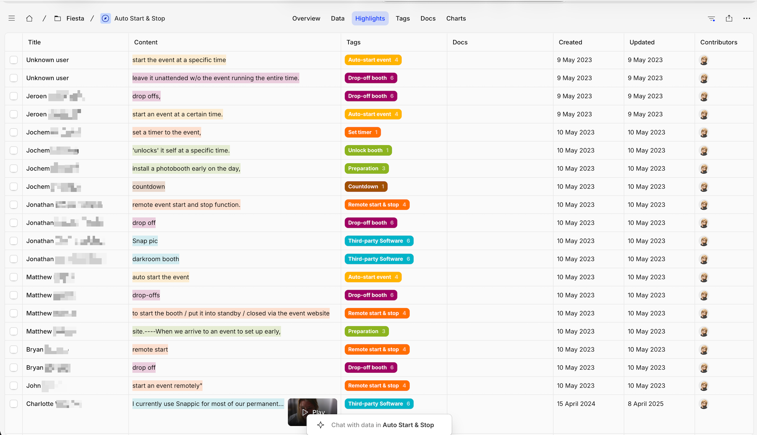
We did all of it — user interviews, support ticket analysis, usability sessions, heuristic audits. The customer support team was a particularly valuable source: they were in direct contact with operators daily and had a clear picture of where people got stuck and what kept coming back as a problem.
The most important thing we learned was the depth of the user range. It wasn't just ‘some operators are more technical than others’, the gap was enormous. The same feature that felt completely intuitive to a photographer with years of experience was confusing for someone who had just bought their first booth. That finding became the lens through which every subsequent design decision got evaluated.
Organising a feature-dense platform around what operators actually do
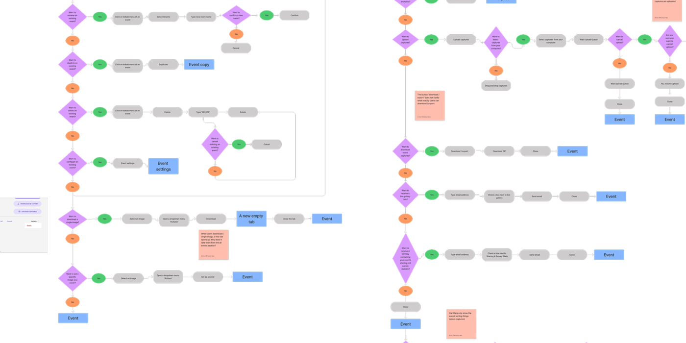
Fiesta covers a broad range of operator needs: configuring the camera, setting up capture modes and effects, managing branding and overlays, controlling the gallery, sharing and printing. The IA challenge was organising all of that in a way that felt obvious regardless of technical background.
Before the redesign, a lot of settings and actions were scattered across the product without a clear logic. The bigger problem was repetition: operators had to redo the same setup steps every time they created an event, even for things that didn't change event to event. The goal was to remove that friction, help operators set things up once, in a way that carried over, rather than starting from scratch each time.
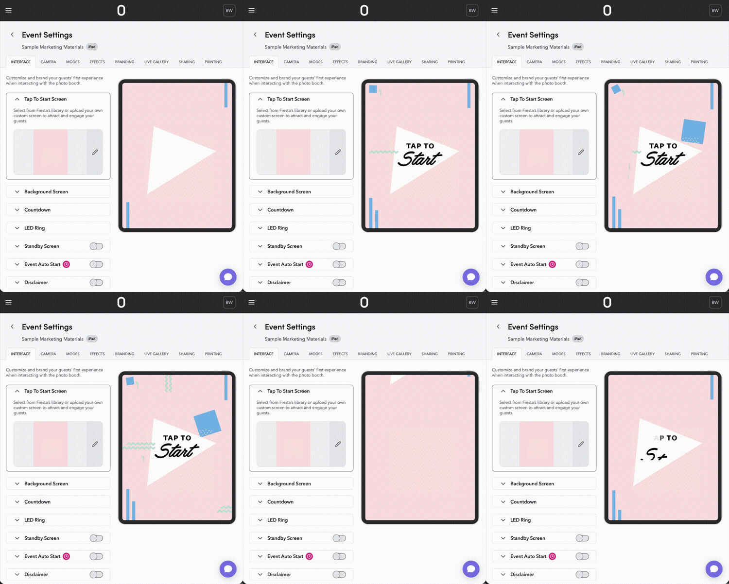
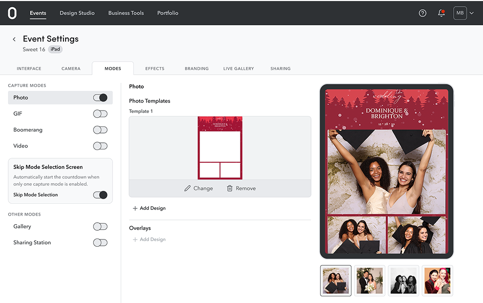
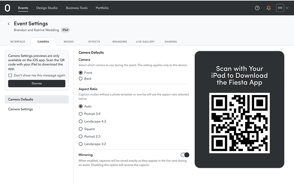
The platform is now structured around 8 distinct sections, Interface, Camera, Modes, Effects, Branding, Live Gallery, Sharing, and Printing, each mapped to a clear job-to-be-done, and arranged so that operators move through them in the natural order of setting up a booth.
Settings arranged as a wizard — left to right, in the order operators actually use them
The navigation in the redesigned platform follows the natural order of booth setup. Operators move left to right through the 8 sections, starting with Interface and Camera, through Modes, Effects, and Branding, and finishing with Live Gallery, Sharing, and Printing. It mirrors how they'd actually work through setting up an event, which means the structure teaches itself.
The same 8-section model runs across both the web dashboard and the iOS app, so operators who learn the structure on web don't have to relearn it on mobile on event day, when there's no time or patience for confusion.
From top-down priorities to ideas from everywhere
In the early years, most feature direction came from leadership, the priorities were set from above and the design work followed. Over time that changed. As the team grew more confident in the product and the user base, ideas began coming from everywhere: operators surfacing needs directly, support flagging recurring friction, and the design and product team identifying gaps through their own product thinking.
Design gets involved early, before there's anything visual to do. Understanding whether a problem is worth solving, for whom, and under what constraints is part of the work, not a prerequisite to it.
Understand the signal
- Ideas come from multiple directions: operator requests, recurring support themes, gaps spotted during product reviews
- Before any design work starts, the signal gets pressure-tested: is this one operator's edge case, or something broader? That distinction shapes everything
Scope and align
- Once a problem is worth solving, the team aligns on scope, constraints, and what 'done' looks like before design begins
- This step keeps exploration focused, it's easier to generate good ideas when the edges are clear
Explore and refine
- Multiple directions get explored before committing to one
- Concepts are tested against the operator range — does this work for the technical power user and the first-timer?
- Feedback from the team and sometimes from operators shapes the refinement until there's a clear recommendation
Hand off and learn
- Handoff to engineering is detailed: annotated specs, edge case documentation, and staying available through build
- After launch, support data, operator feedback, and usage patterns tell you whether it landed the way you intended
Building a design tool for non-designers
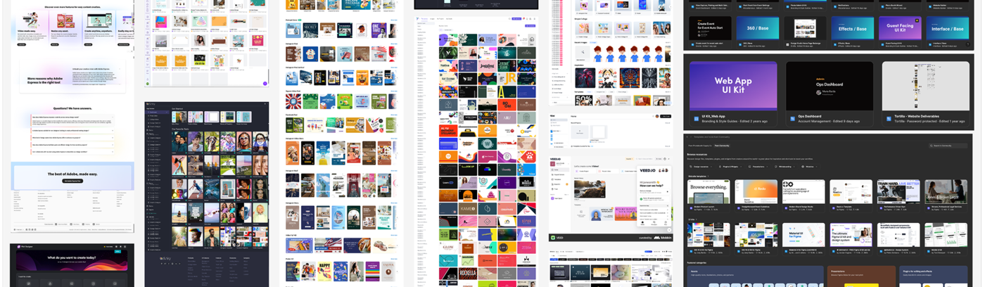
Design Studio gives admins a library of pre-designed templates: strips, overlays, frames, and a built-in editor to customise them for any event. No design skills needed.
Admin system and Guest system, built separately for different audiences
The product has two distinct user groups with very different needs: operators (who set up and manage everything through the admin interface) and guests (who interact with the booth and gallery experience). One monolithic system wouldn't work for both, the visual language, tone, and interaction patterns are fundamentally different.
The Fiesta Admin design system covers everything operators touch: event management, hardware configuration, settings, analytics, and galleries. The Guest design system covers the in-booth and guest-facing gallery experience. Each has its own component library, token set, and documentation.
Fiesta Admin system — for operators managing their business
- Covers the web dashboard and iOS app that operators use day-to-day
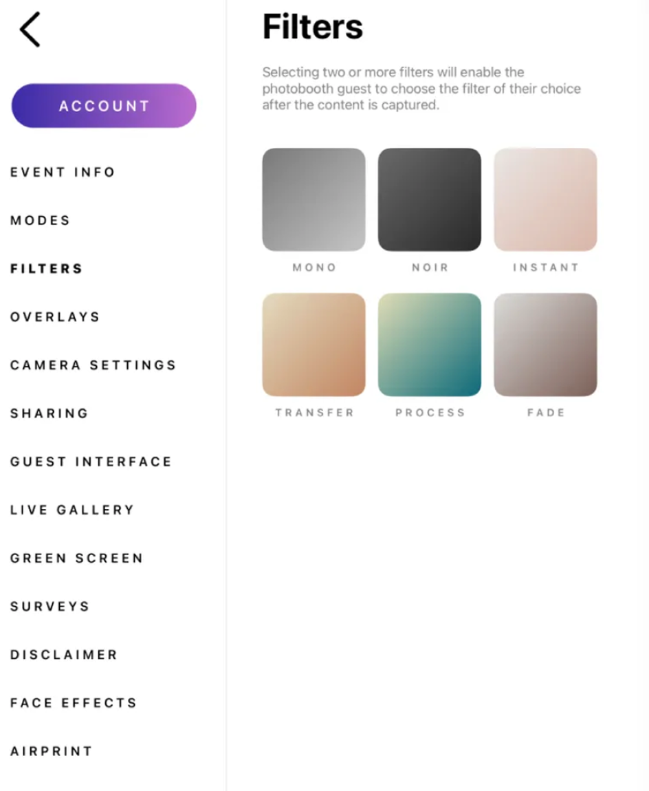
- 8 main sections: Interface, Camera, Modes, Effects, Branding, Live Gallery, Sharing, and Printing, each with their own set of components and settings patterns
- Built to be functional, clear, and fast to use under event-day pressure
Guest design system — for guests interacting with the booth
- Covers what guests see and interact with at the event
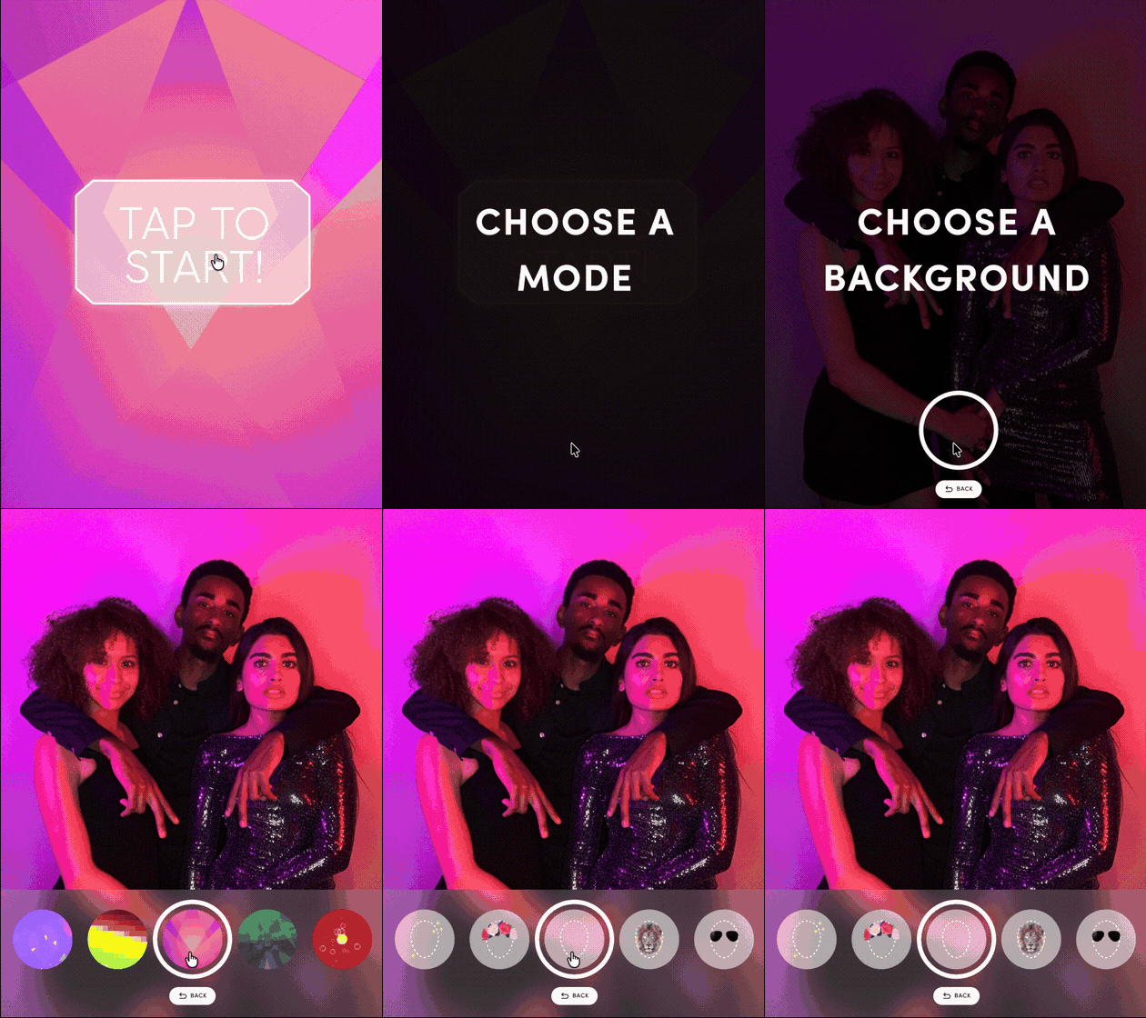
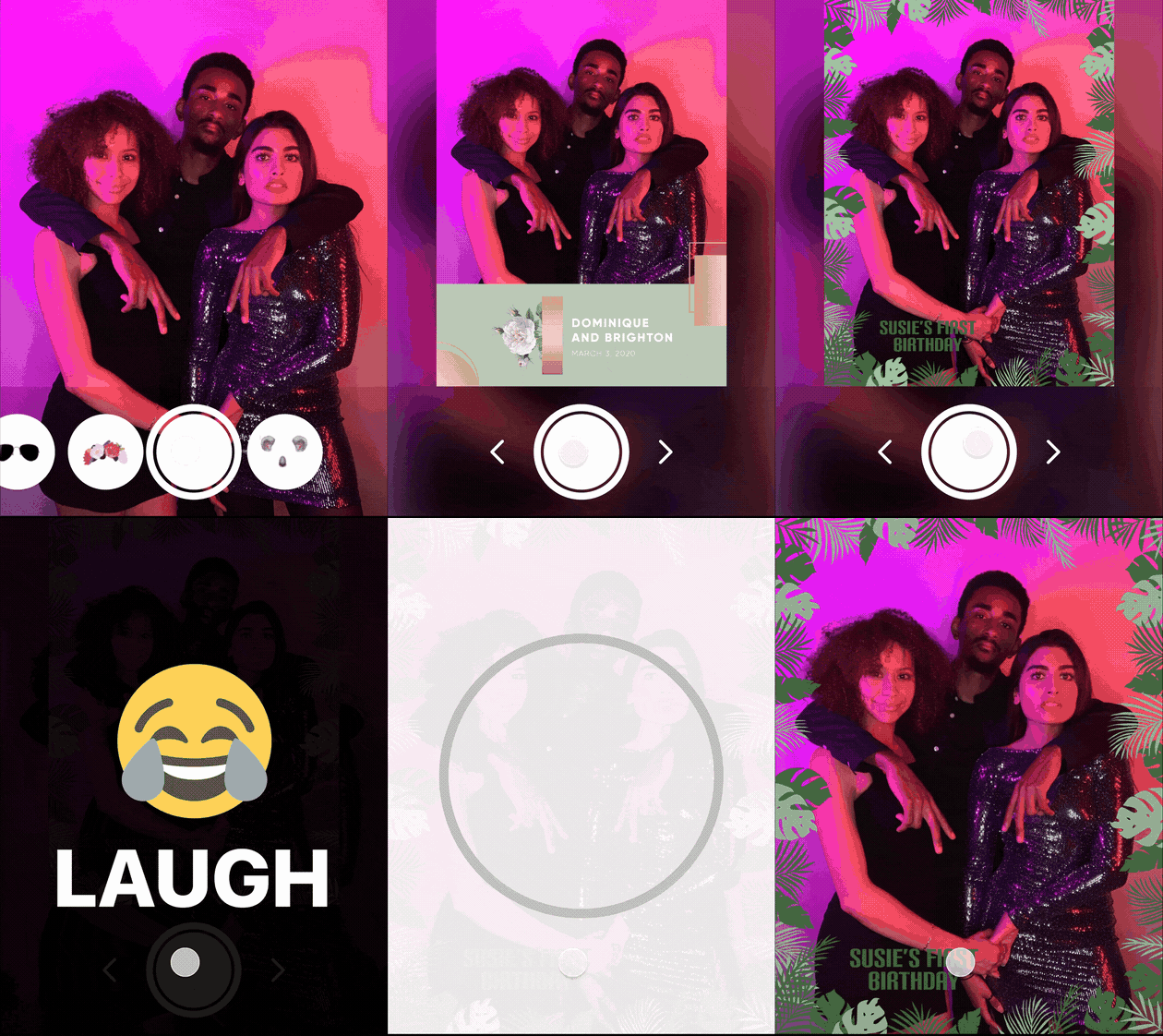
- The core is the in-booth interaction — selecting a capture mode, choosing filters, backgrounds, and overlays before taking their photo
- Different visual language from the Admin system: more expressive, brand-flexible, and designed to feel like part of the event itself
Starting from visual identity and building outward
The Fiesta Admin system is anchored in a strong visual identity that stays consistent across all sections of the platform. That visual foundation came first; the component library and token system were built on top of it, section by section, as the product grew.
The Guest system required a fundamentally different approach. Where Admin is built for efficiency and control, the Guest UI is built for the moment, expressive enough to feel like part of the event, flexible enough to accommodate the branding operators apply on top. The two systems share no components directly, but maintain a relationship through shared principles around spacing, feedback, and interaction behaviour.
Over 5 years, both systems grew alongside the product. New sections, new components, new patterns, the system had to absorb all of that without losing coherence. That meant periodic audits to catch drift, conversations with engineering when implementation diverged from design intent, and ongoing decisions about what to standardise and what to leave flexible. A design system on a live product is never finished; it's maintained.
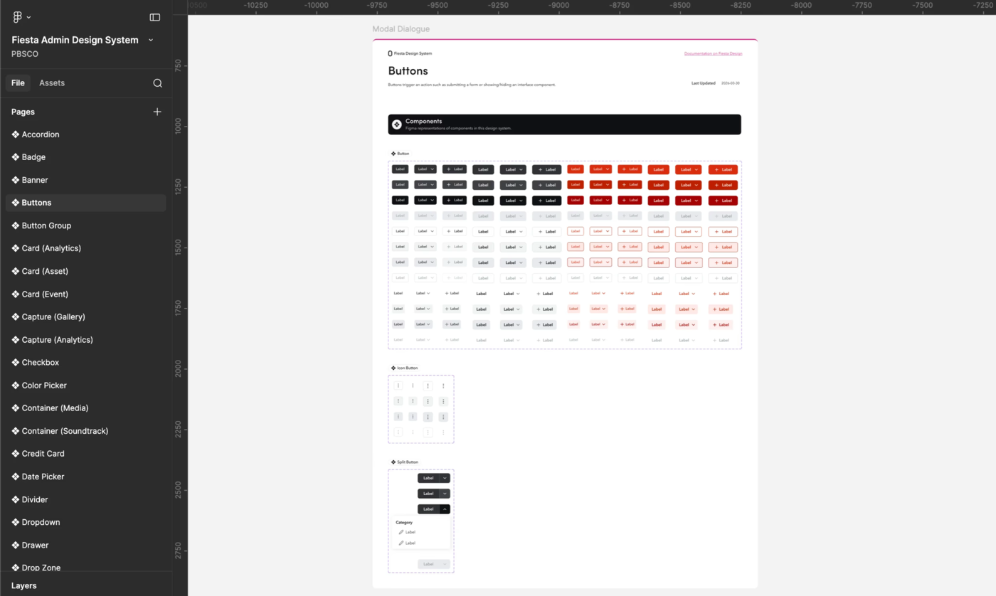
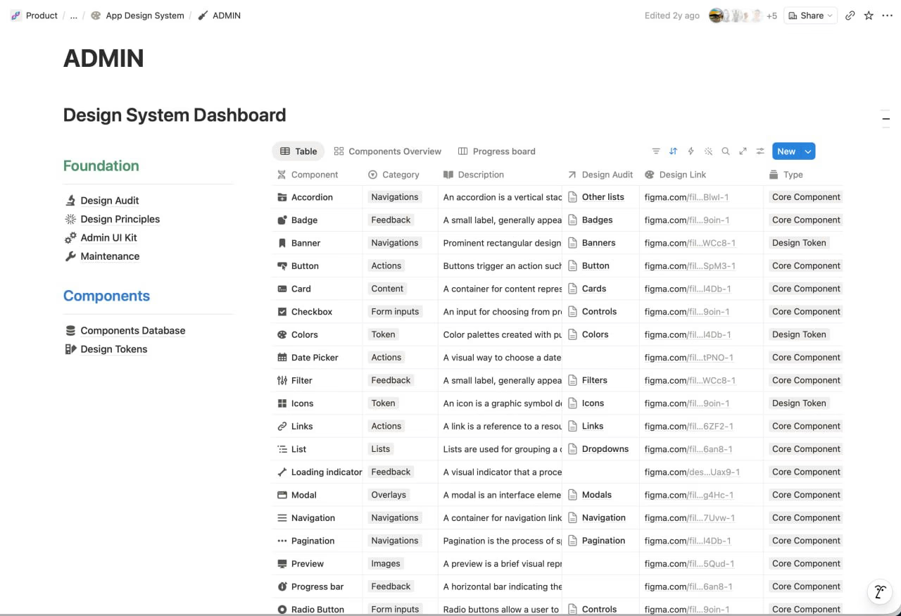
Documented in an Admin UI Kit in Figma and an Admin Design System in Notion.
Complexity of the admin role
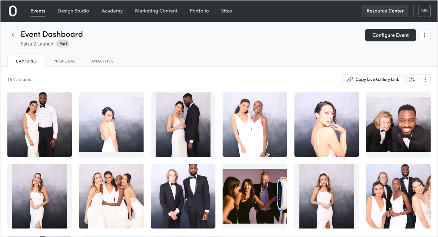
Admins don't just run events, they configure them. The web app is where everything gets set up before the booth goes live: capture modes, templates, camera behaviour, gallery sharing. Designing for this meant balancing depth of control with a setup flow that works for non-technical users under time pressure.
Web App
Designed for everyone at the party
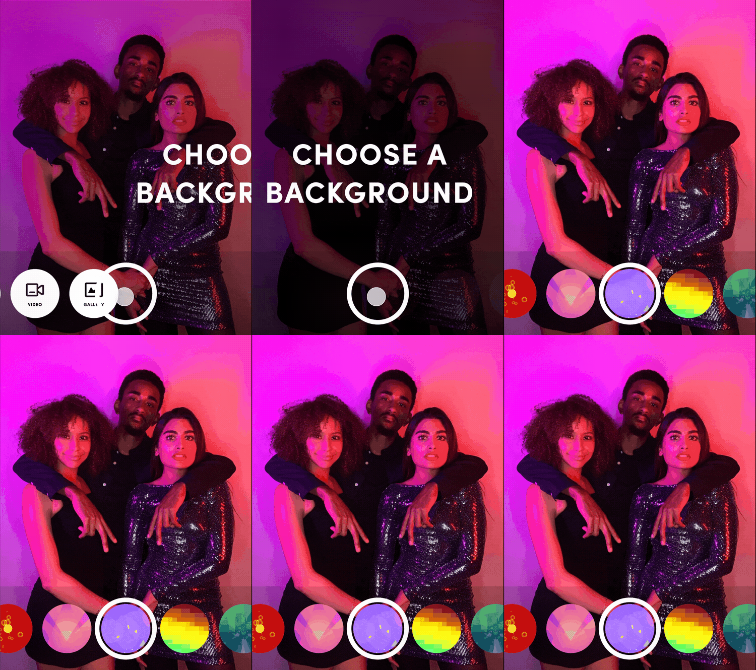
A photo booth is used by guests of all ages, from kids to grandparents, often in a loud, busy environment, and sometimes by people who don't speak English. The iOS app needed to feel instantly familiar, not require reading.
I drew on interaction patterns people already know from Instagram, TikTok, and Snapchat: swipeable mode selection, large tap targets, and icon-led controls that communicate through shape rather than text. The result is a flow most guests can navigate without instruction.
Guest Experience (iOS)
What made this hard
Designing for an extreme range of technical confidence
- The same interface had to serve a retired photographer who's been using the software for years and someone who bought their first booth last month
- There was no tiered product, just one platform — every labelling decision, every settings hierarchy, every error state had to work for both ends of that spectrum simultaneously
Keeping web and iOS in sync across a growing feature set
- As new features shipped on web, they eventually needed to exist on iOS too, but the two platforms have different form factors, interaction patterns, and contexts of use
- Operators use the web dashboard to set things up; they use iOS on event day, under pressure — maintaining a shared mental model across both without forcing the same UI onto different contexts was an ongoing challenge
Two design systems that can't drift too far apart
- The Admin and Guest systems are intentionally different, but they can't become entirely separate languages over time
- As both systems evolved across 5 years, maintaining a coherent relationship between them, shared principles, consistent terminology, compatible interaction patterns, required constant attention alongside the feature work happening in parallel
Settings at the event level that probably belong at the account level
- Some configuration that we placed at the event level, where operators set it up per event, would have been better handled at the account level, set once and inherited
- Operators ended up repeating work they shouldn't have had to repeat — it's a structural decision that's hard to undo once it's embedded in the product
What I learned
Research is still necessary, even when the company already knows its users. PBSCO had a lot of internal knowledge about operators, there are photo booth owners on the team, and the support department talks to users every day. I went in thinking that gave us a head start on understanding the user. It does, but it's not the same thing as research. Support views operators through the lens of problems to resolve. That's valuable, but it's a different angle than understanding how operators think, what they're optimising for, and how they actually experience the product.
If I were starting over, I'd push harder for dedicated research time upfront, even with all that existing knowledge in the room. The other thing I'd change is how I worked with engineering during build. I'd push for more visibility into what was being built as it was being built, more check-ins, more shared context, so that what shipped was closer to what was designed, and surprises on both sides were fewer.